Meme 101
Top text, bottom text: the grammar of a meme
White capital letters with a black outline, one line above the picture, one below. Every part of the classic meme layout is doing a job.

Look at enough memes and you'll notice they all look the same: a square picture, white capital letters with a thick black outline, one line at the top and one at the bottom. The forums of the mid-2000s called this an image macro - a picture with a caption you could stamp onto it again and again, like a keyboard shortcut. It became the standard because each part of it works.
The top line sets it up
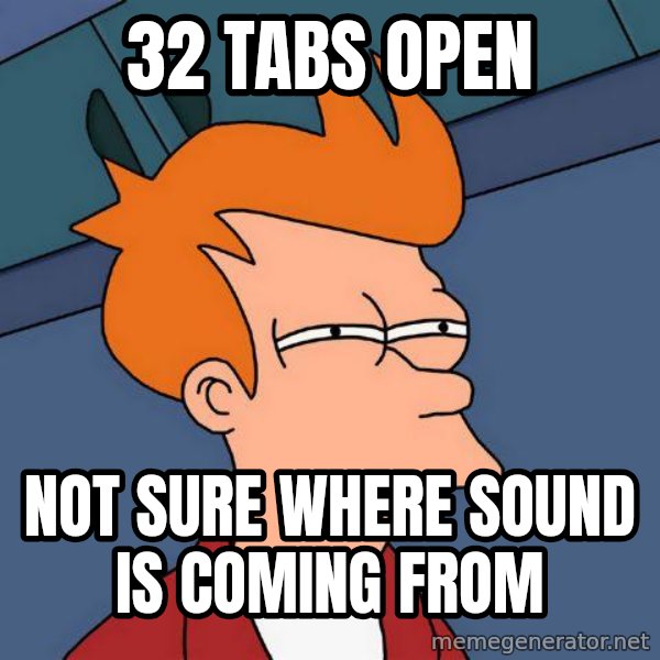
The top line is the setup: who, where, what's going on. “Arrives home.” “Puts in USB.” “32 tabs open.” It's short, and it's usually not funny on its own - it's there to make you expect something.
The bottom line pays it off
The bottom line is the punchline, and the picture tells you what kind of punchline to expect. Under Futurama Fry it's a suspicious question. Under Bad Luck Brian it's a disaster. Under Good Guy Greg it's a kindness nobody saw coming. The reader's eyes go top, picture, bottom - setup, reaction, payoff - in about a second.
Why Impact, why capitals
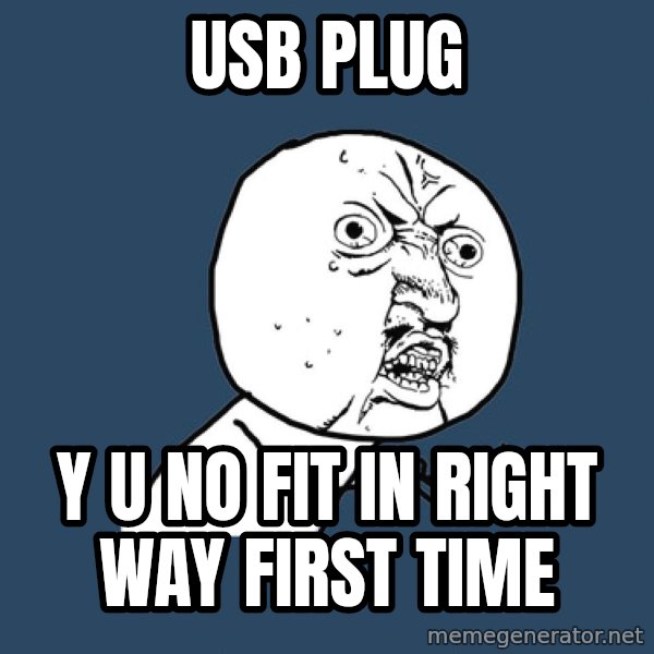
The letters are almost always Impact, a heavy, narrow typeface from 1965 that came free with Windows, so everybody had it. It's condensed, so a lot of words fit across a picture, and the black outline makes white text readable on any photo, light or dark. Capitals read like shouting, which suits a punchline.
Breaking the rules
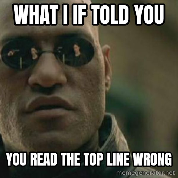
Because everyone knows the grammar, breaking it is a joke too. Yo Dawg takes the top line and does something absurd with it; What If I Told You tells you that you read the top line wrong. Those only work because the rules are so familiar.
When you make one here, the letters are drawn for you in the classic style. Keep each line short - most of the best posts on this site use fewer than ten words in total.
More stories
- What is a meme, anyway? - A word a biologist made up in 1976 now names the internet's favourite kind of joke. How a picture and two lines of text became a language millions of people speak.
- Advice animals: the colour-wheel years - A dog in front of a rainbow wheel started a whole family of characters, each with one personality and one job. How Advice Dog's descendants took over the internet around 2010.
- Rage comics: when the internet drew itself in MS Paint - Wobbly lines, a handful of faces and one big feeling per panel. The crude comics that gave us Trollface, Forever Alone and Y U No.
- Meme Celebrities: the people behind the faces - A yearbook photo, a stock photo shoot, a day at the beach. Nine ordinary people who woke up one morning to find their face had become a joke the whole world knew.
- From the big screen to the top text - A line from The Lord of the Rings, a smirk from 1971, a beer advert and a squinting cartoon. How film and TV became the internet's favourite raw material.
- Beyond two lines: panels, boxes and captions - Top and bottom text is only one way to caption a picture. The newer formats put words in boxes, beside panels or above the image - and you can make all of them here.
- How to make a meme that lands - Pick the right face, follow its formula, keep it short and be specific. Five rules from the millions of posts made on this site.